‘It’s very easy to be different,
but very difficult to be better.’
For designers in any field, “being different” is almost instinctive — they can endlessly generate variations that look distinct. But “being better” requires refinement, discipline, and the accumulation of effort over time.
Train yourself to notice the difference and know why.

Master visual literacy to shape perception.
HiFi Iteration: Where Details Speak
Design logic is the full rationale behind a design—covering technical, functional, cultural, integrity and visual dimensions. Visual literacy is the ability to shape perception, make consistent, deliberate choices in form, proportion, and unity so that the design ‘makes sense’ visually. Train yourself not only to sense these choices but also to explain and defend them.
Step 1
Train Your Eyes to See the Nuance.
See — the nuance, the subtle shifts of form and light.
Care in design often lies in details invisible to casual observers yet deeply felt in perception.
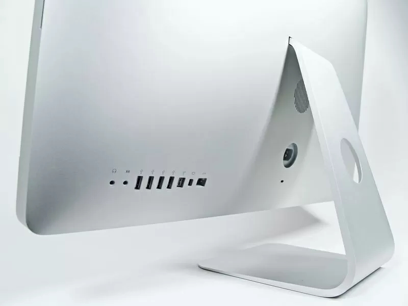
the ‘disappearing’ look of the support.
2007-2009-2012


Design with Light
The new chamfer reduced glare and making the transition from edge to surface feel smoother to the touch.
MacBook Pro Chamfer Edge (2016)


what's the rationale behind design decisions
These are the layers that may never be explicitly visible in the final artifact, but they shape how it feels, how it lasts, and how it resonates.






Active Doing, Not Passive Browsing
Observation in design is not passive looking but active seeing—training the eye through sketching, recording, and repetition. Like playing music instead of merely listening, this practice reveals structure, rhythm, and nuance that casual browsing never teaches.
Step 2
Interpretation
Understand — articulate why it matters, in design logic terms—proportion, hierarchy, rhythm, coherence, negative space, craft and feasibility, sensory and lighting.
Object speak - through Sensory Resonance
“This is not brute force, but crafted power.”
Aston Martin

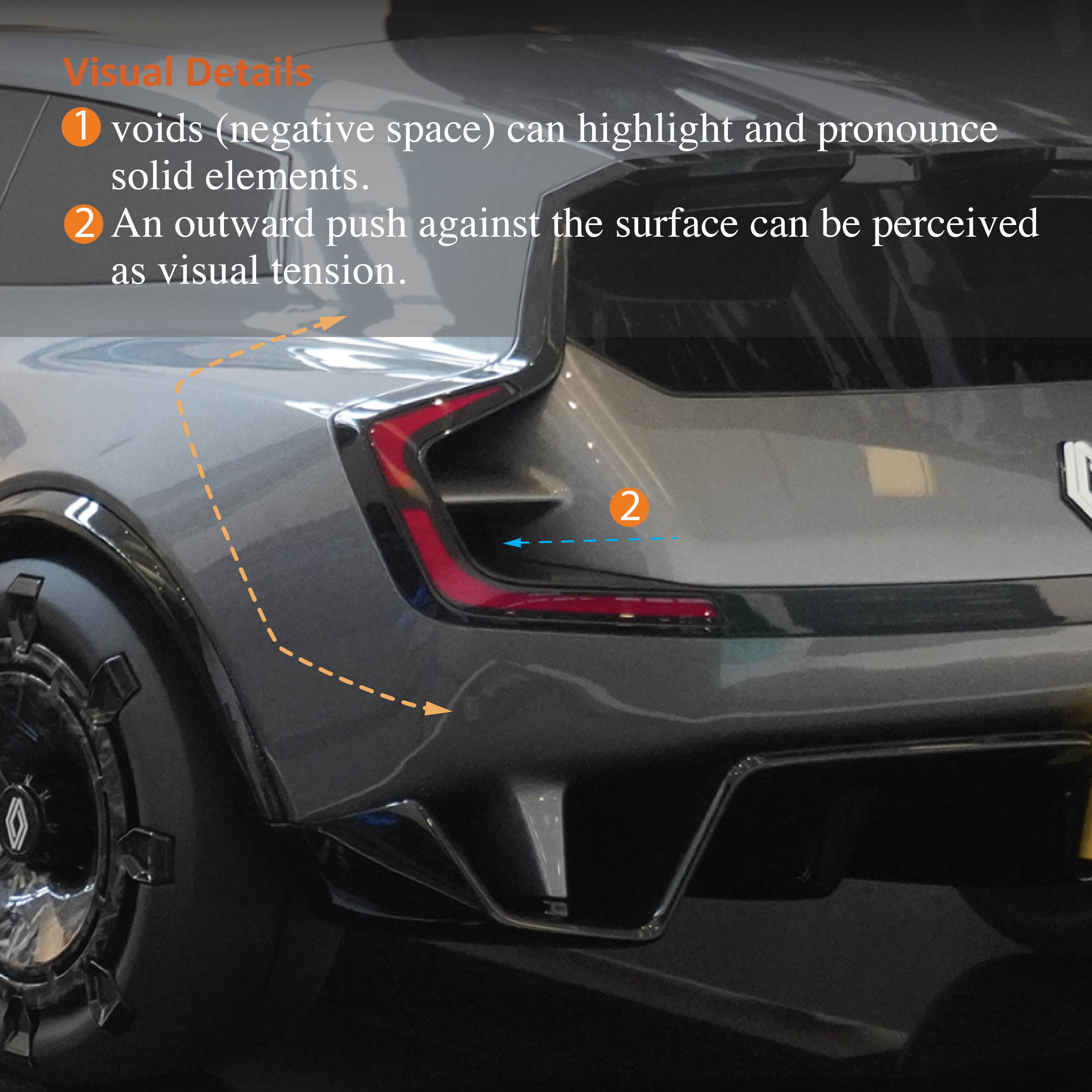
The thin, blade-like twilight feels like an outward push pressing against the surface, creating a visual tension.

Bright color are prioritized by the eye, while darker parts like the exhaust visually recede into shadow.
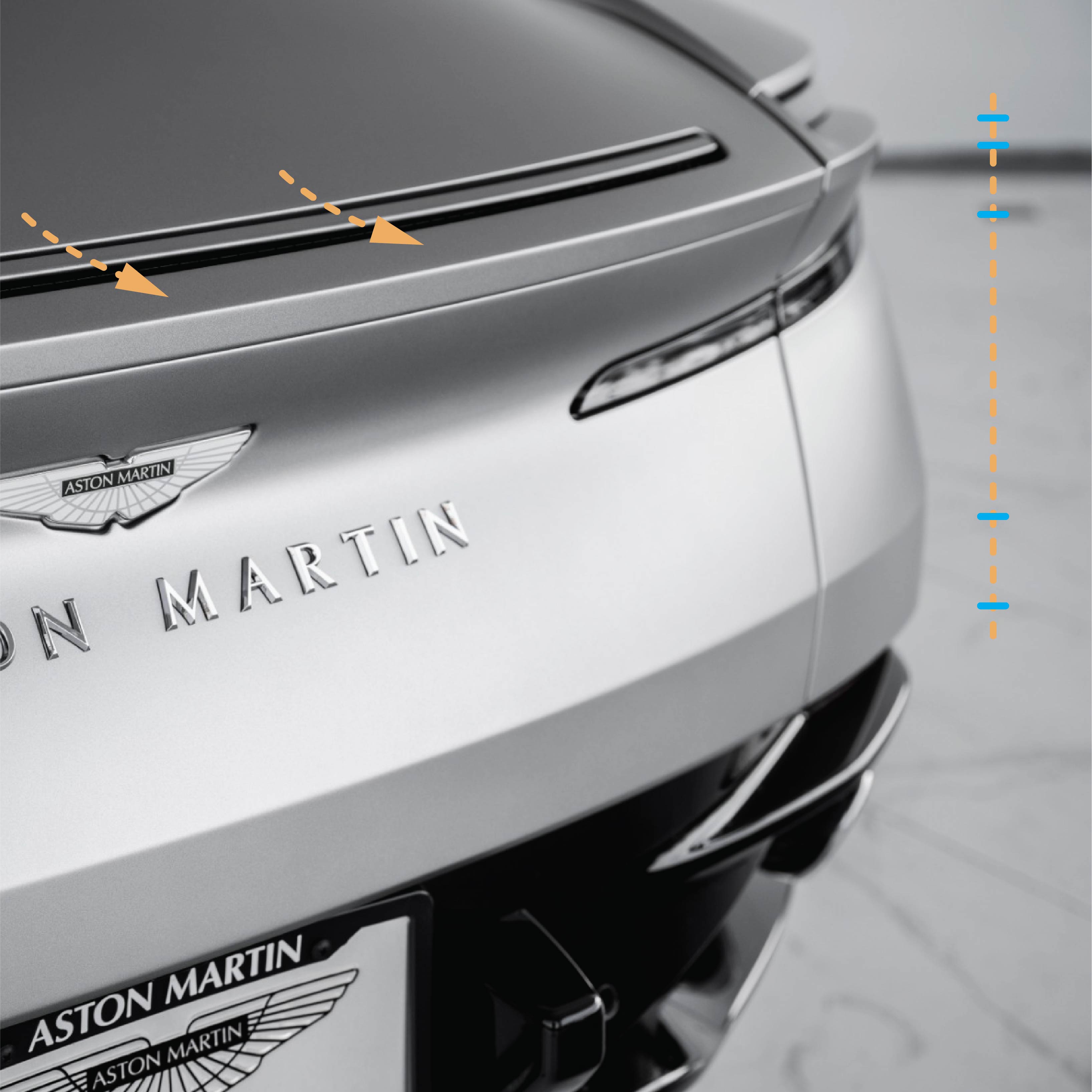
The sharp trunk-edge line pushes outwards, creating a sense of precision, contrast creates precision.
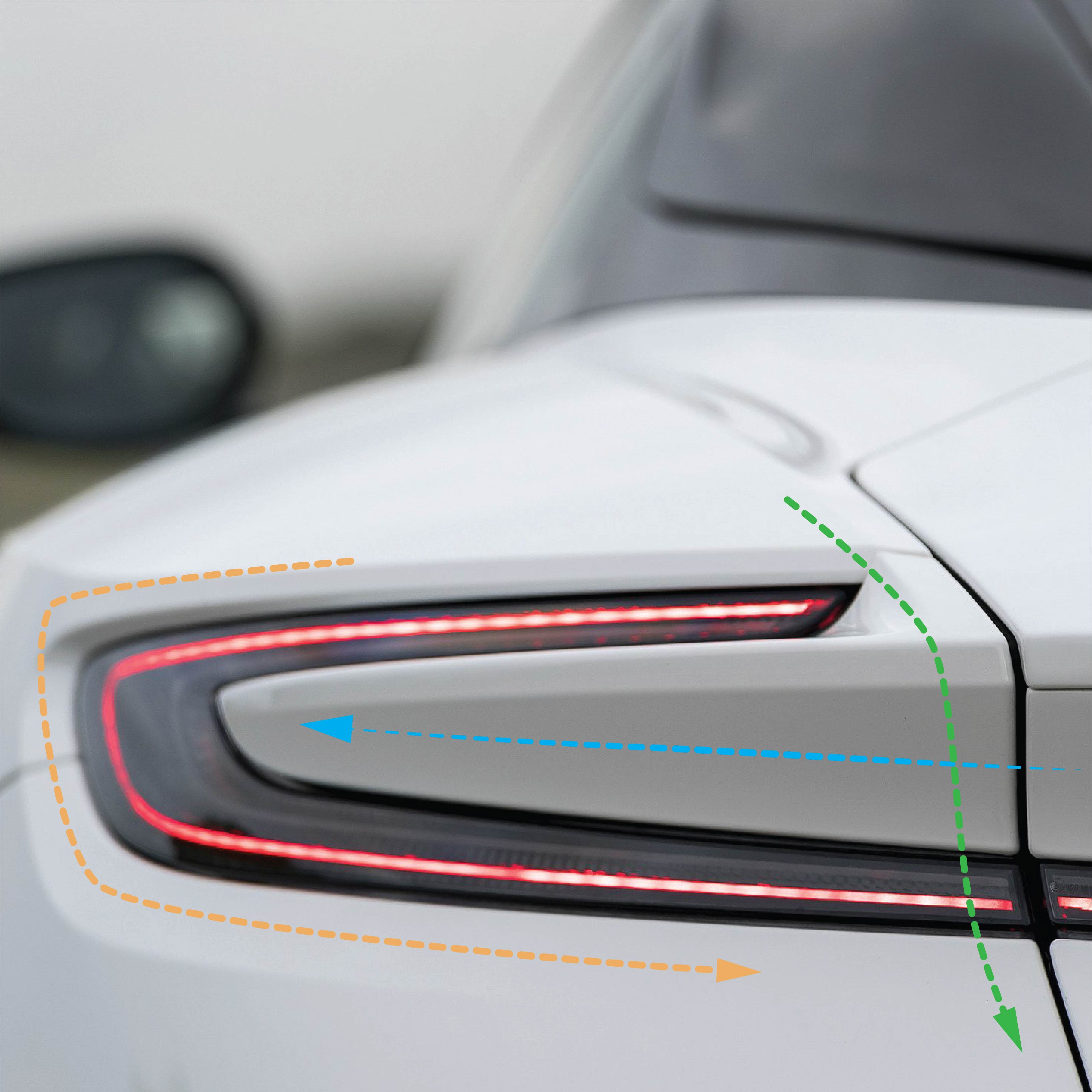
Unity comes from how bodywork and light graphics intertwine — function and form locked together.
subtle changes can flip interpretation.
Perception of form can shift with very small manipulations of structural orientation, shading or highlight, etc.
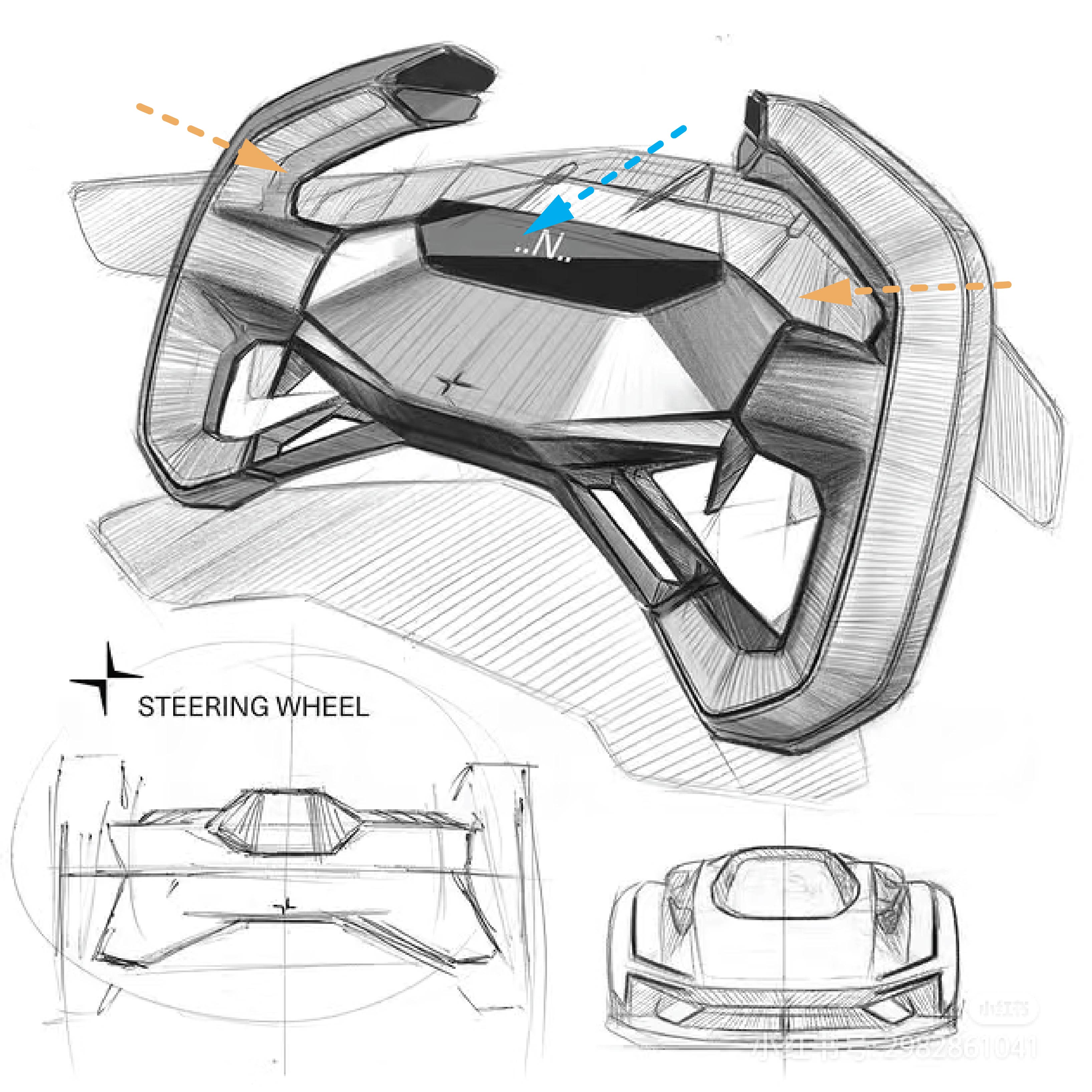
Sketching
The grips angle inward slightly toward the center display module, Then, they sweep outward, which creates a more push-pull relationship: in → outward. strong chamfer on grips suggest haptic cues.
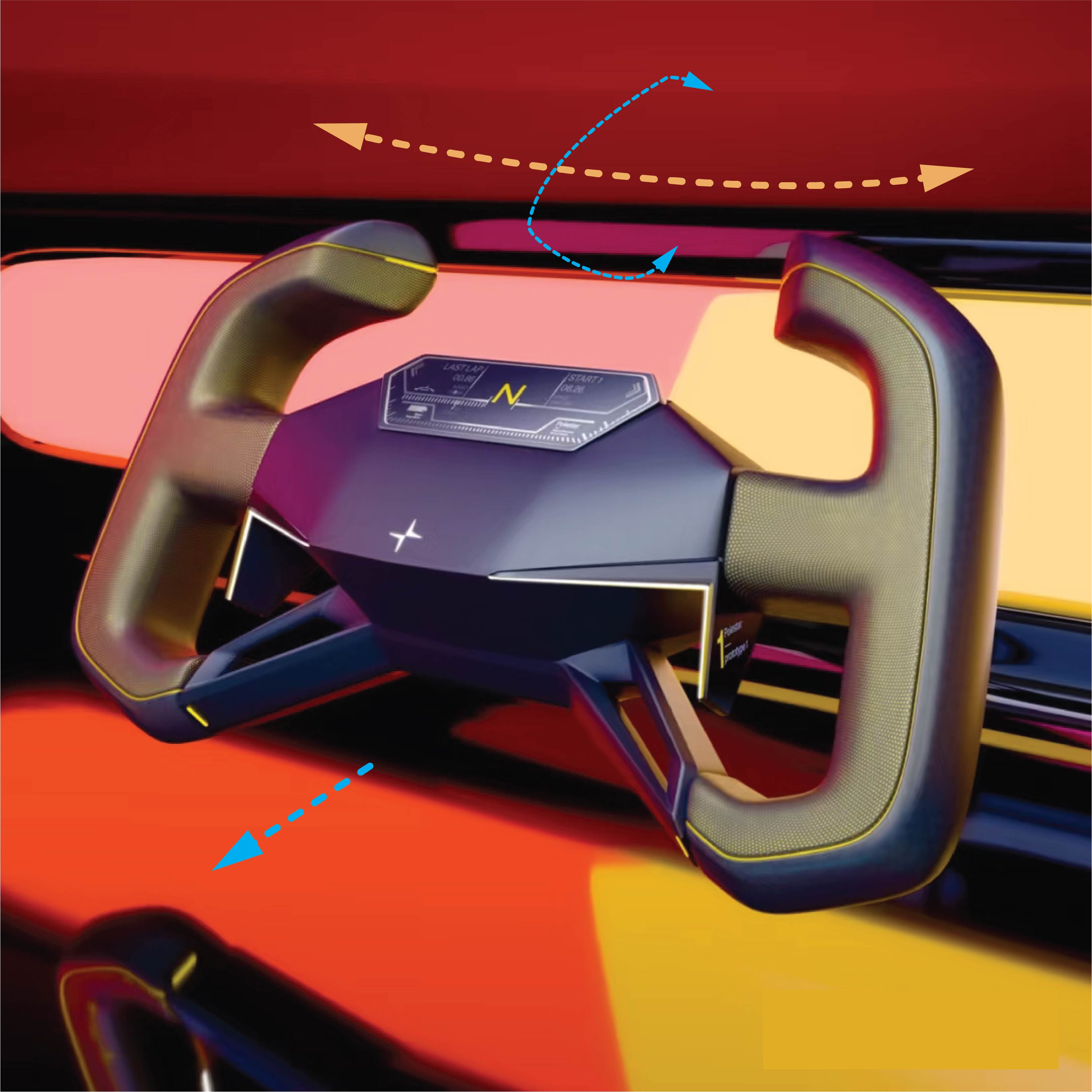
Rendering
Be aware there’re changes from sketch to renderings. The central geometry poked outward, emphasizing dominance and presence.The soft visual on grips indicate a dominant, substantial hold.
A change in proportion leads to a change in perception.
Contemplate a design through the deliberate manipulation of light and shadow transitions.

2020 ASTON MARTIN DB11 Volante
A pronounced chamfer catches light cleanly and reduces perceived thickness, tail volume sits lower and visually wider, giving a stable and athletic stance.

2025 Aston Martin DB11 Volante
Rear surface reads sharper and fuller at same time, planted stance with less chamfer. The design emphasizes the mass and more “grounded” strength.
Objects speak - through craftsmanship

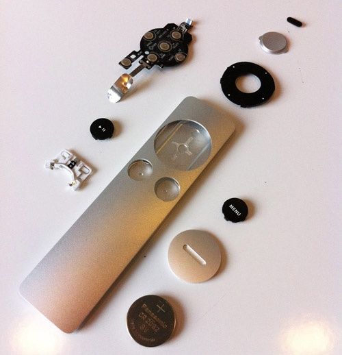
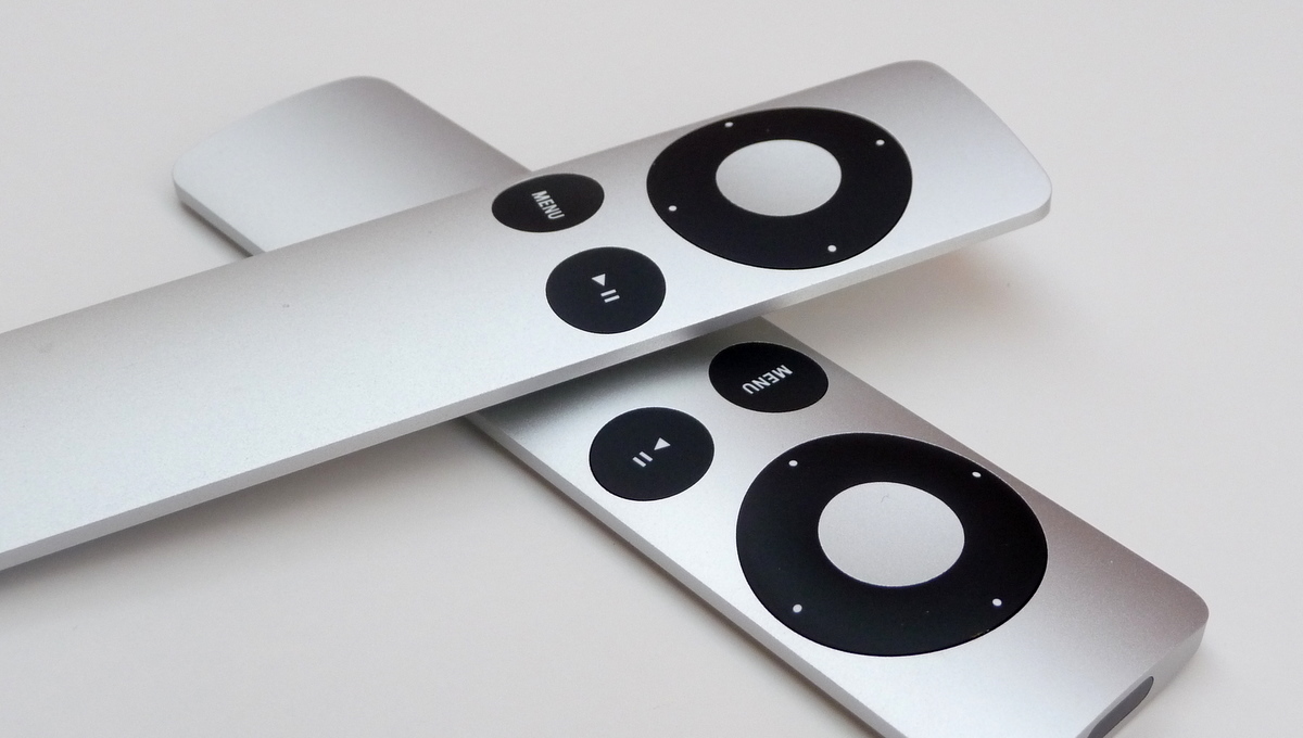
Aluminum remote unibody amplify its seamless experience. – Here’s Apple’s secret craftsmanship
Design is the First Act of Craftsmanship.
Good craft is a design choice, Not a manufacturing afterthought. Anticipate tiny tolerance errors and design ways to mask them, which means plan for minor tolerance variation and incorporate details that hide them.
(coming soon)
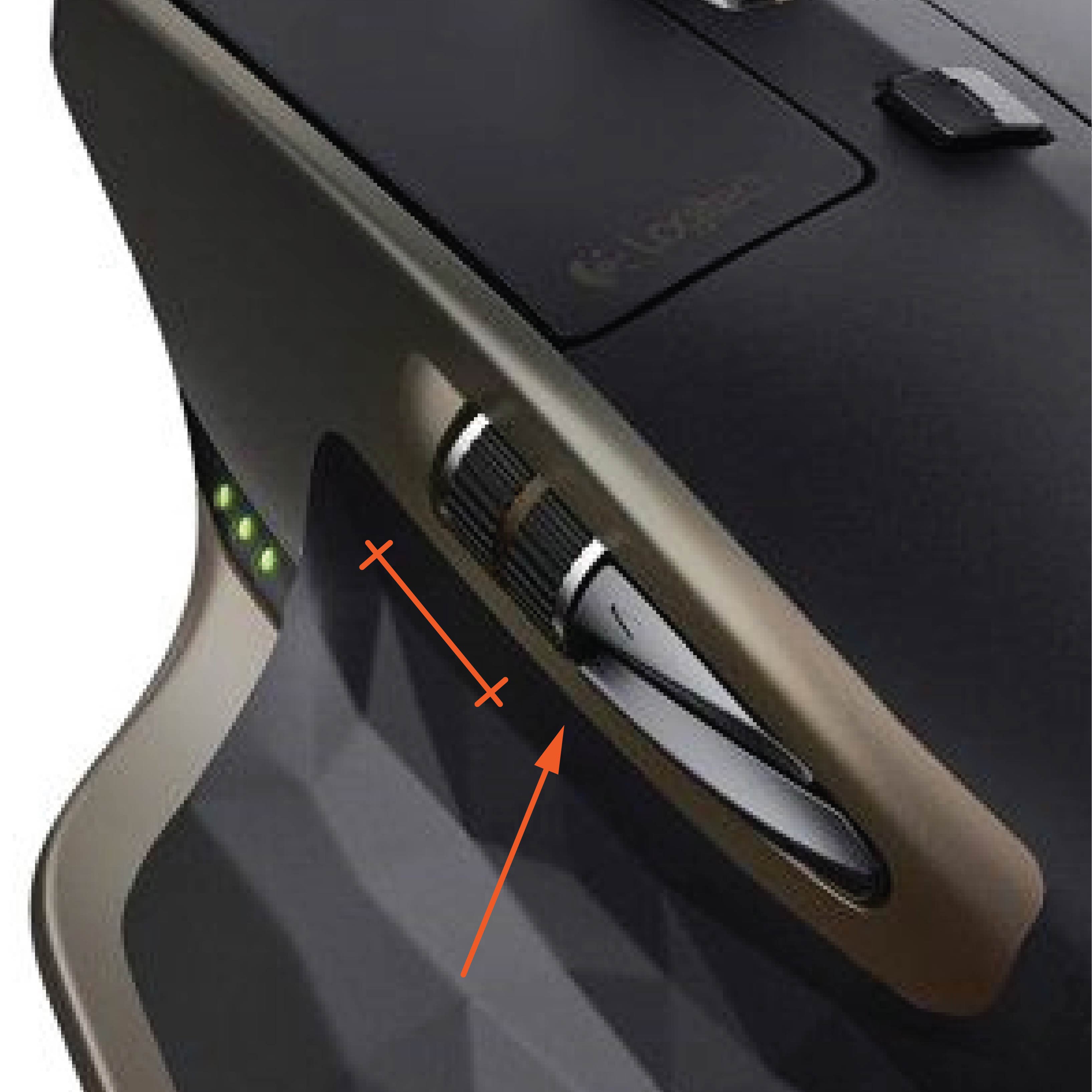
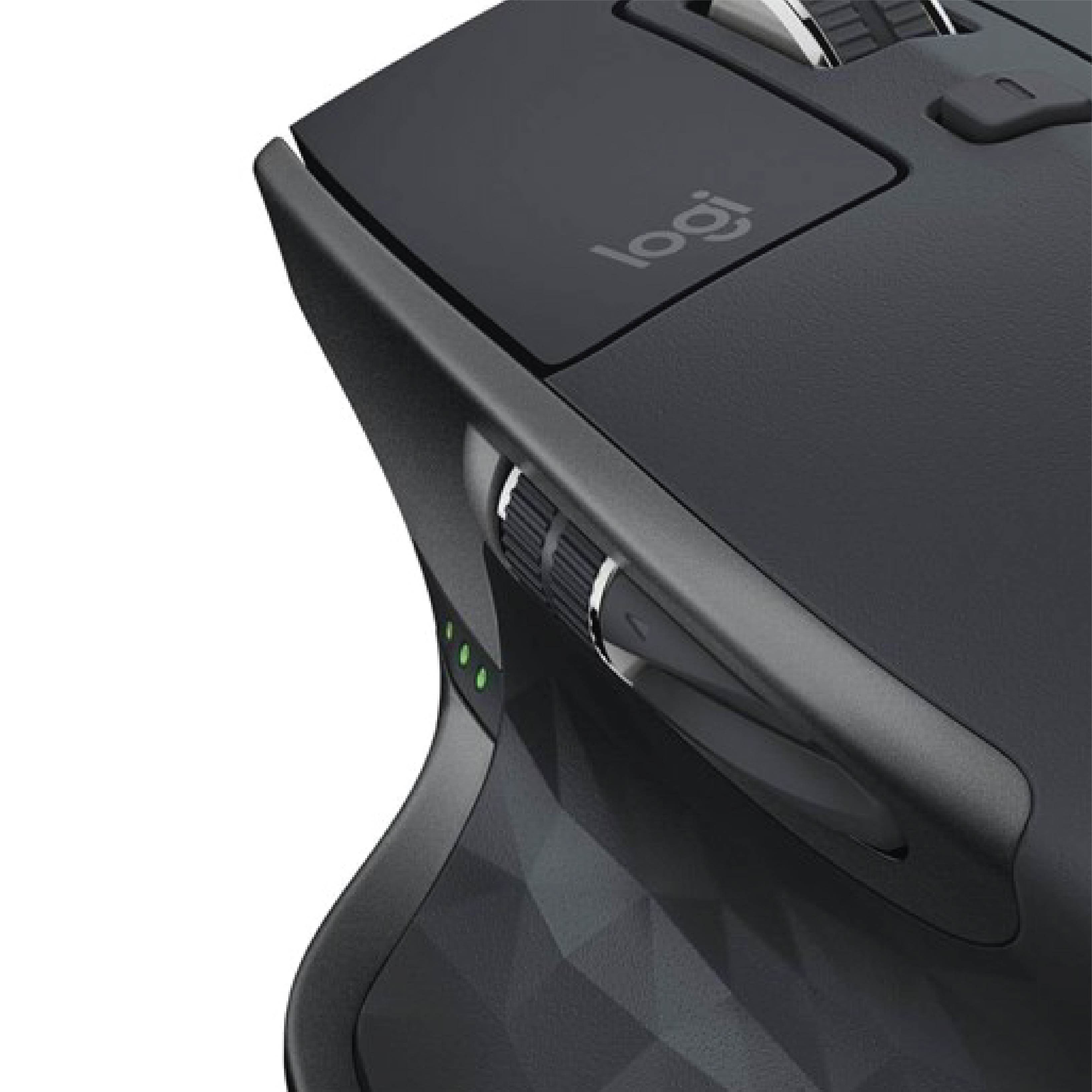
Logitech MX Master M-R0066
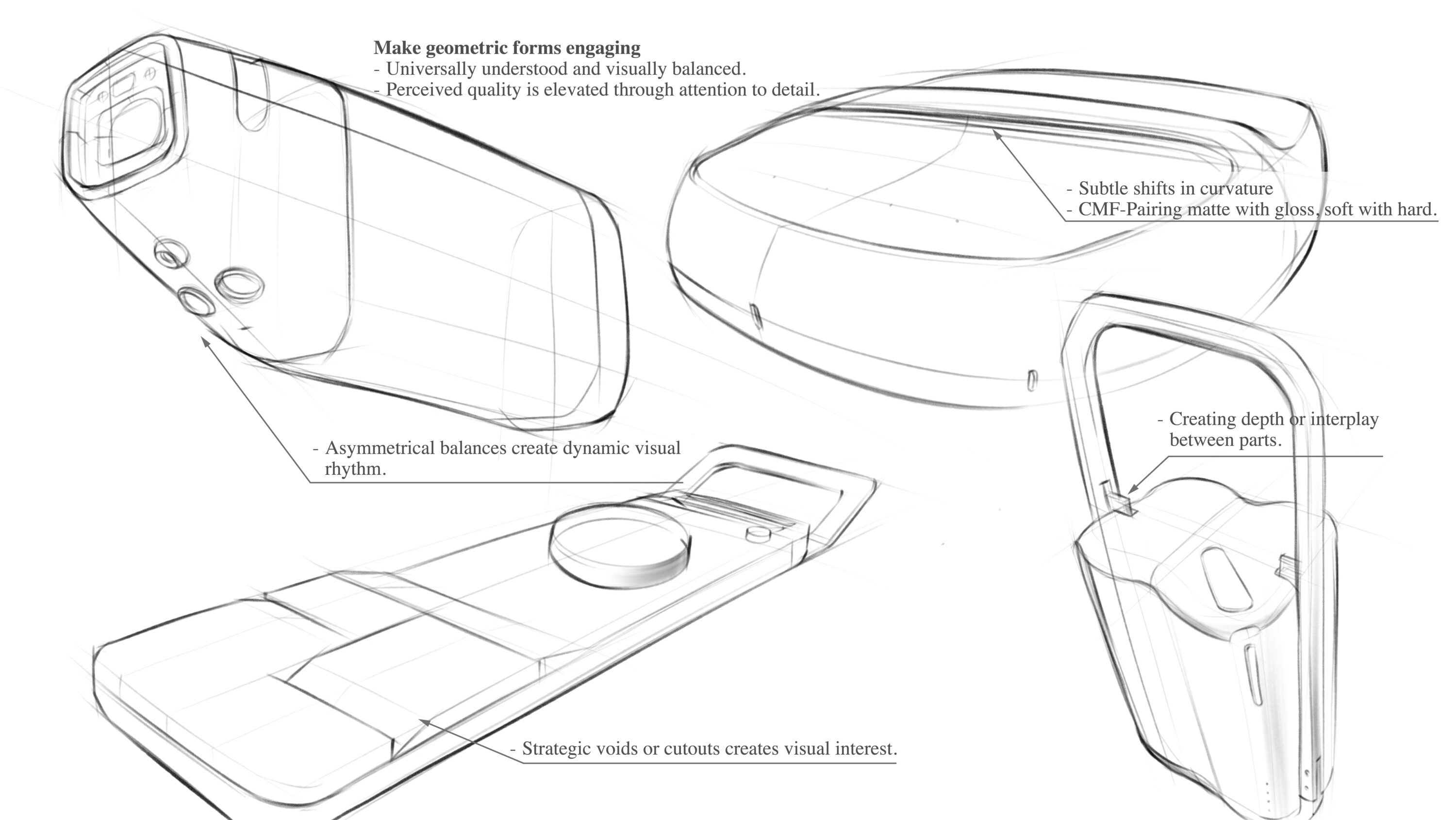
Busier aesthetics can disguise minor flaws but at the cost of proportion clarity and a less premium feel.
Details and transitions sacrifice usable space for scroll wheel. This busier treatment not only affects the clarity of the form but also introduces additional challenges for manufacturing and assembly.
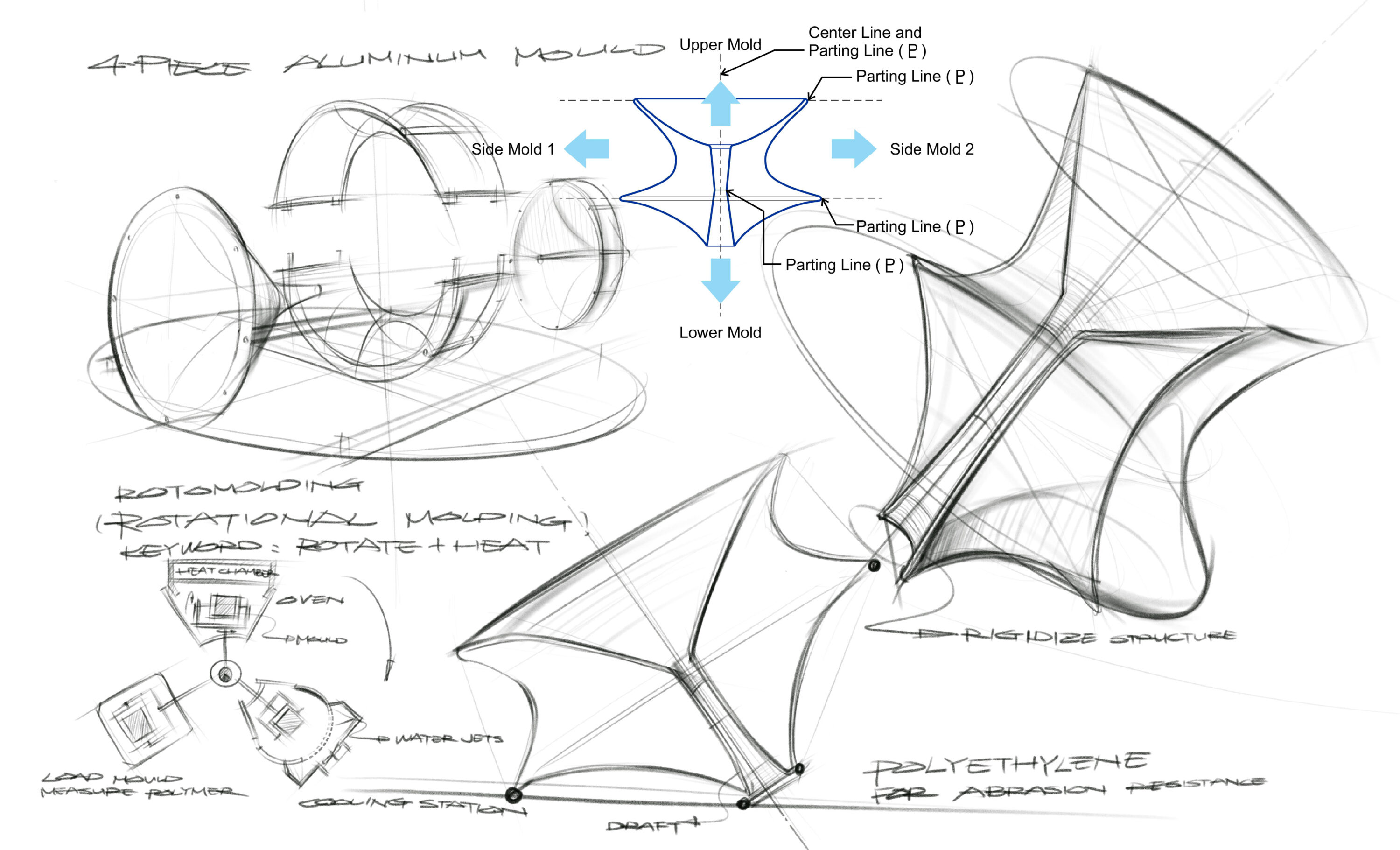
Multiple breaks and complex surfaces add more mold parting lines, which increases tooling complexity and risk of visible seams.
More fragmented geometry makes alignment trickier; higher chance of gaps or misfit during assembly.
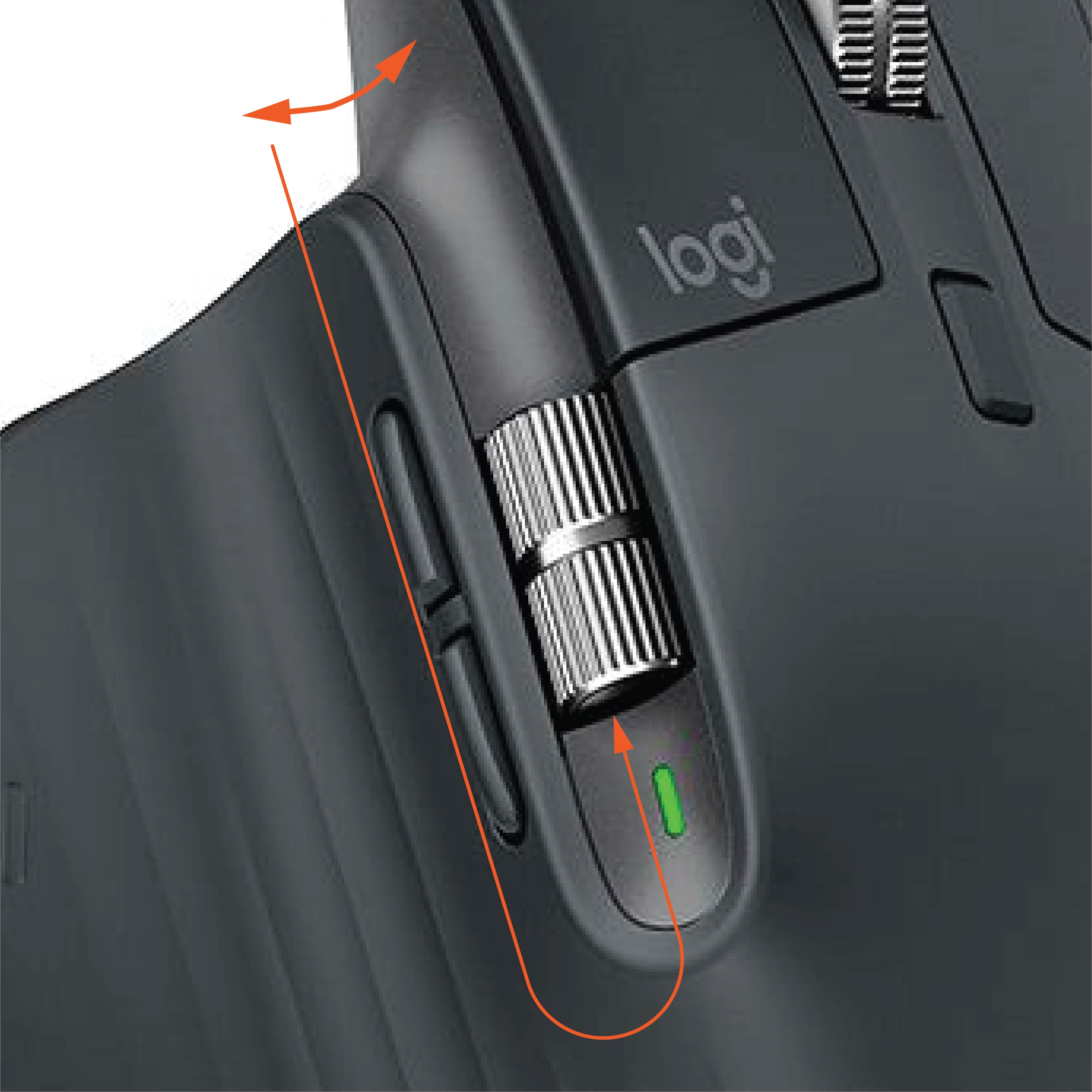
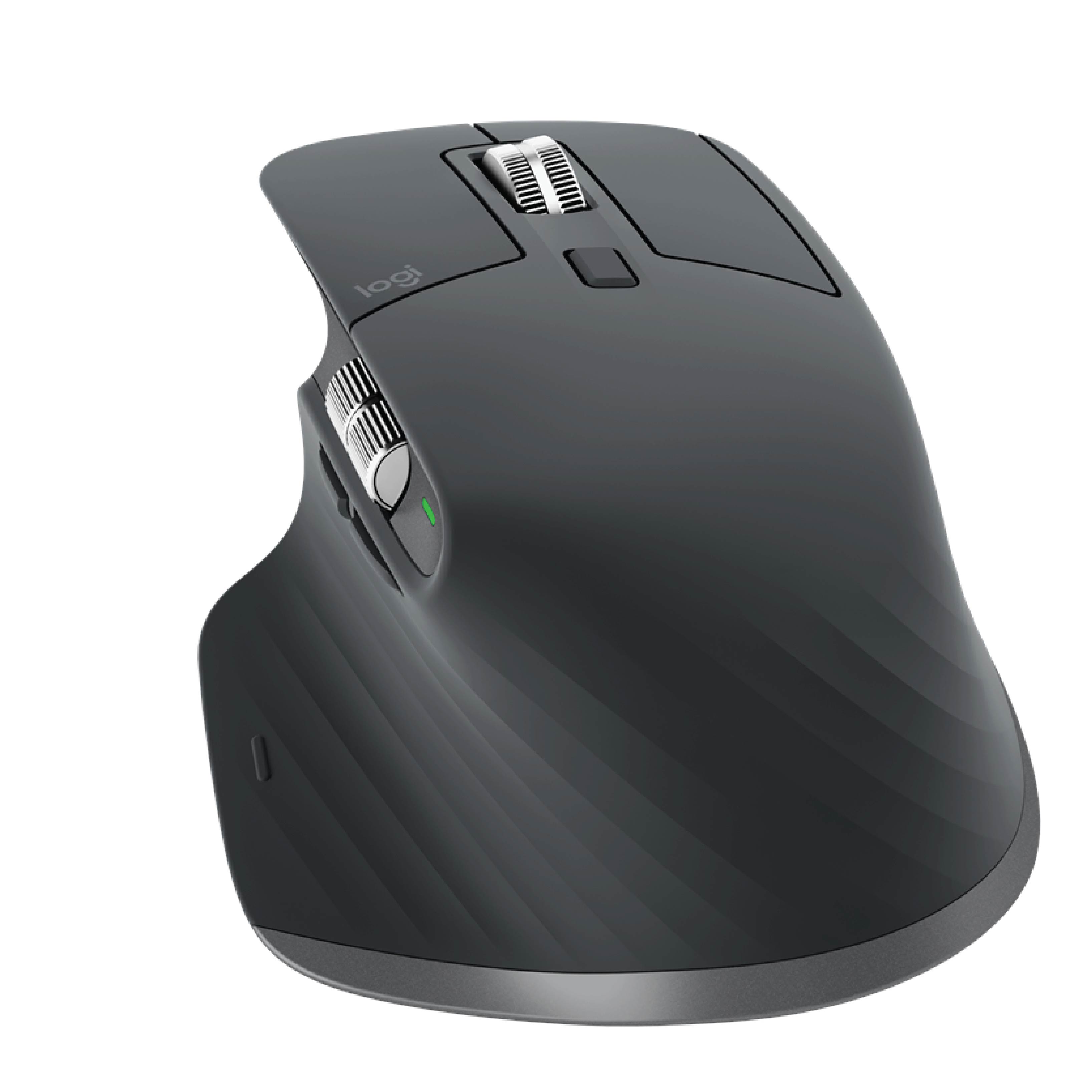
Logitech MX Master 3S
the scroll wheel sits neatly within its cutout, and the surrounding lines don’t create awkward breaks. The parts separation is also handled cleanly.
Manufacturing/assembly unforgiving. the trade-off of the cleaner “flush” lines it’s hard to hide imperfections, the risk of visible defects.:
1. Any mismatch in color, gloss, or texture between parts becomes highly noticeable, increasing the need for quality control.
2. Minimal design leaves even tiny tolerance errors (like uneven gaps, misalignment, or wobble in the wheel) much more noticeable.
Invisible work crafts meaningful messages.
Sensitivity Beyond the Visible.
Invisible work in design includes visual literacy, sensory resonance, structural integrity, strategic alignment, ethical responsibility, and temporal experience.
“I find that aesthetics matters a lot, you know? Beauty matters. It’s not irrelevant. There should be things that are beautiful and artistic and meaningful that make life worth living.”–Elon Musk at Moontalk 2026
Visual Literacy
– Balancing proportion, rhythm, hierarchy, and unity.
– crafting proportions and relationships that feel deliberate, harmonious, and cared for.
Cultural & Sensory Resonance
– Rooted in lived experience, memory, symbolism.
– The role of lighting, spatial presence, and tactile qualities in shaping atmosphere and emotion.
Temporal Experience
– How the design unfolds over time (e.g., unboxing, first touch, wear/aging gracefully).
Sensitivity to time as part of perception and meaning.
Integrity (Structural & Functional)
– Manufacturing feasibility, structural logic, durability.
– Precision and craft that make an object feel “solid or craftmanship” even if unseen.
Strategic & Branding Considerations
– How design choices align with identity, narrative, and business priorities.
– Subtle choices that influence how a product fits into a larger business narrative.
Ethics & Responsibility
– Sustainability, recyclability, and social responsibility.
– Deliberate choices that reflect cultural and civic responsibility.
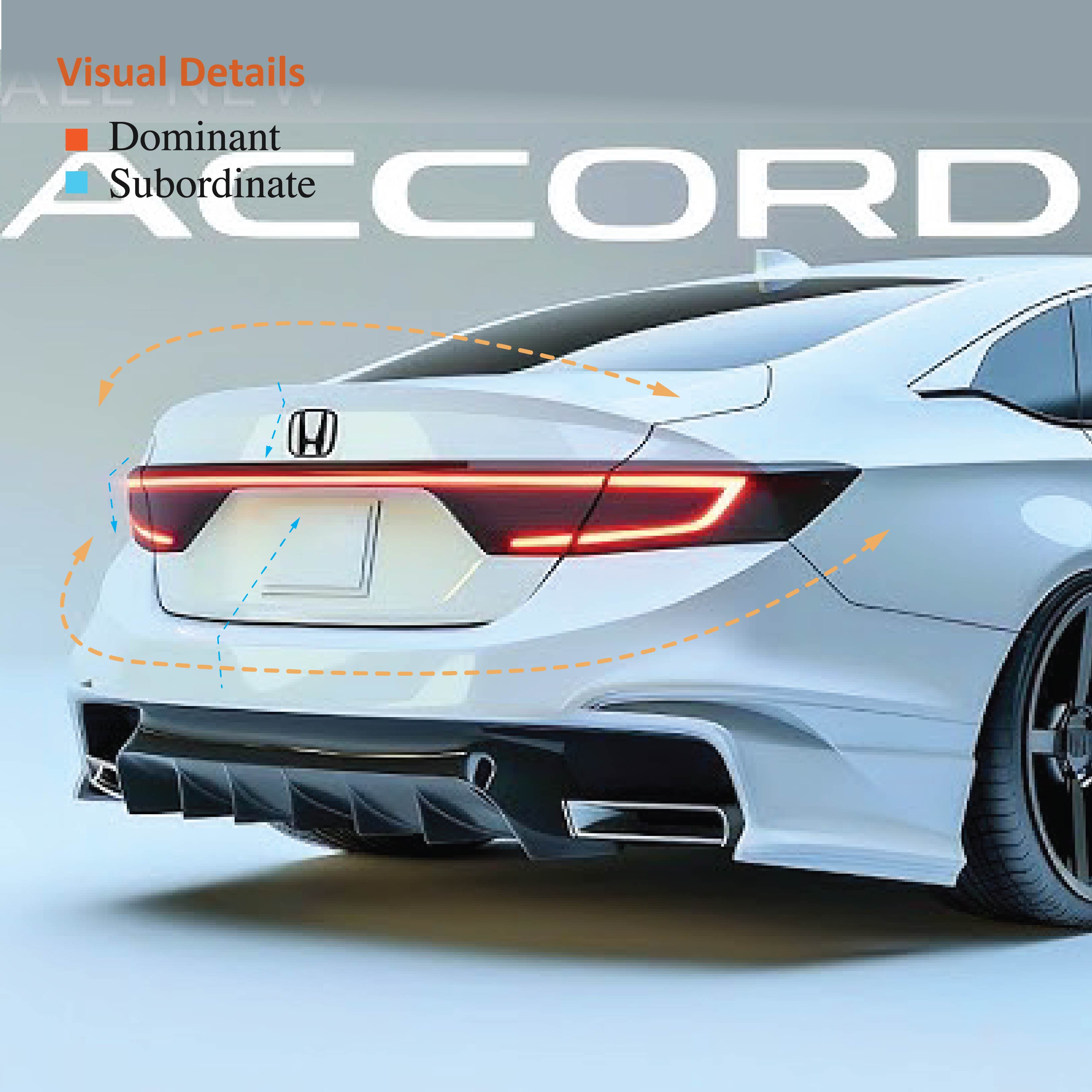
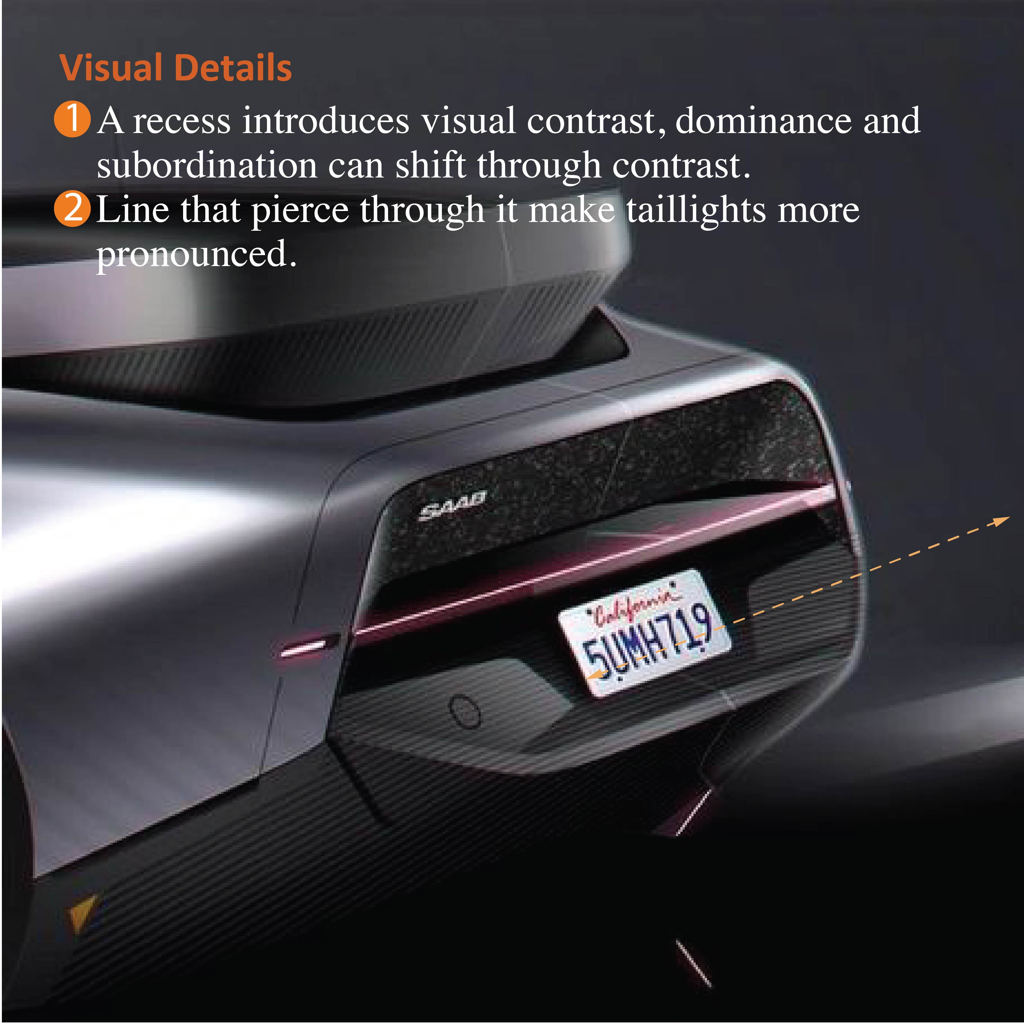
articulate The intent
More information regarding visual perception and crafting messages.
If everyone is busy making everything,
How can anyone perfect anything?
We start to confuse convenience with joy, abundance with choice.
Designing something requires focus. the first thing we ask is what do people want to feel delight, surprise, love, connection, then we begin to craft around our intention.
It takes time…there are thousand no’s for every yes.
We simplify, we perfect, we start over, until everything we touch enhances each life it touches.
Only then do we sign our work.
– Designed by Apple in California –
Step 3
craft with intent
Express — through craft with intent, letting the object speak.
