Visual Relations

visual relations

In the Context of Industrial Design

Relations

The design element could work alone. In most cases, it involves several elements.

Dominant-Subdominant-Subordinate

It could include dominant, subdominant, and subordinate volumes. Dominant volumes are the largest shapes with the most character; they are the center of attention. The more minor subdominant form complements the dominant and enhances the shape. The most minor subordinate form adds more 3D volume and completes the shape.

-Source: Rowena Reed Kostellow

Direct Surface Contact

For a balanced relationship, volumes complete each other. While small forms come together with more dramatic larger forms, each of them has its weight and is important.

However, It does not have to be a complex visual solution. Primitive forms with direct surface contact (without transition in between) will do the job too. It usually communicates a strong sense of craftsmanship and is mathematically precise. That minimal design requires a higher standard for tooling and CMF.

Transition

Many internal components exist to make a product functional, such as a motor, PCB, battery, etc. Usually, the internal parts are kept hidden so that the user interface can stay clear and undistracted. There are also sophisticated transitions between the components and the outer surface, which could be for ergonomic or aesthetic reasons.

Solid-Void

Solid is a matter of presence, and Void is the absence of it.

Solid is perceived to be heavier in mass. Voids are scooped out and formed by the enveloping surface. It is negative space in visual design, and like a pause in music, speech, writing, which is significantly powerful to play a counterbalancing role.

Core Principle

Gestalt Principle

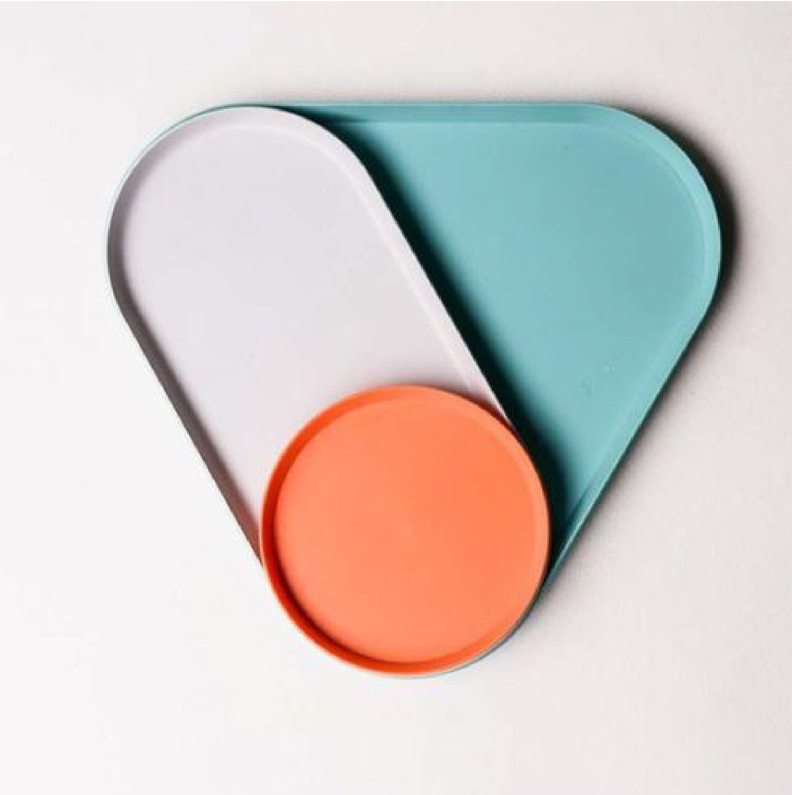
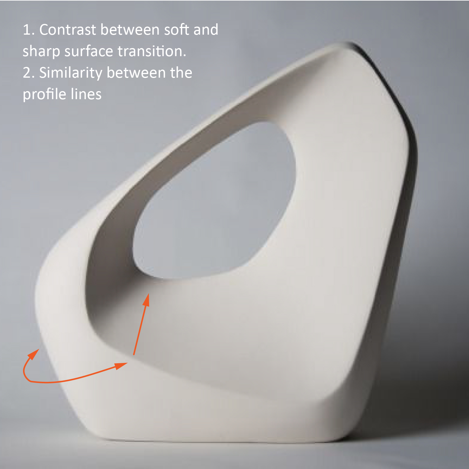
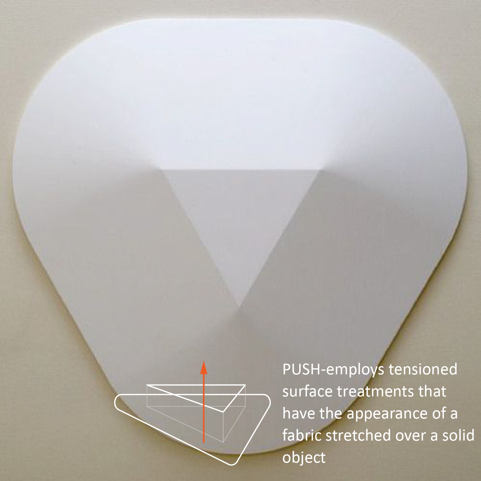
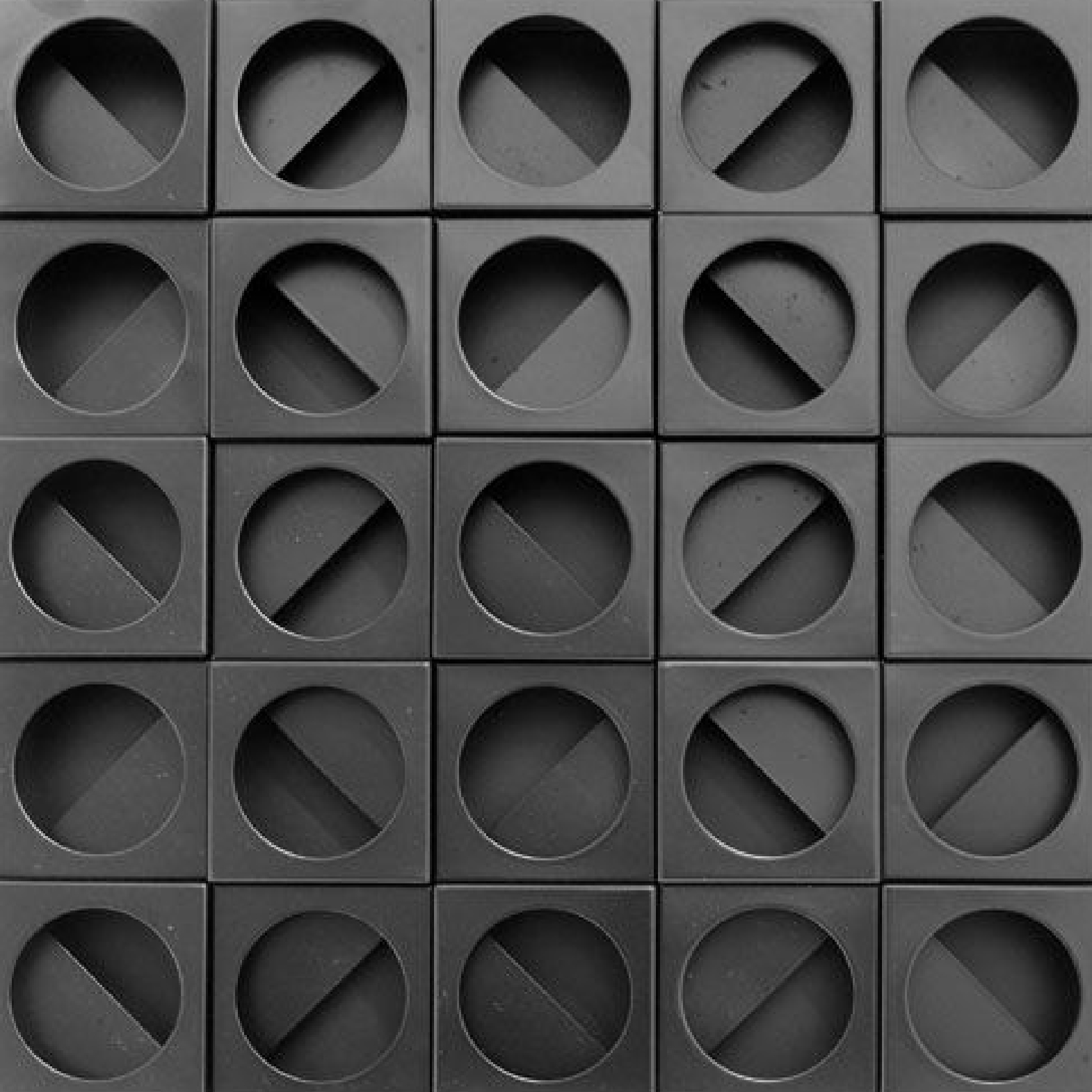
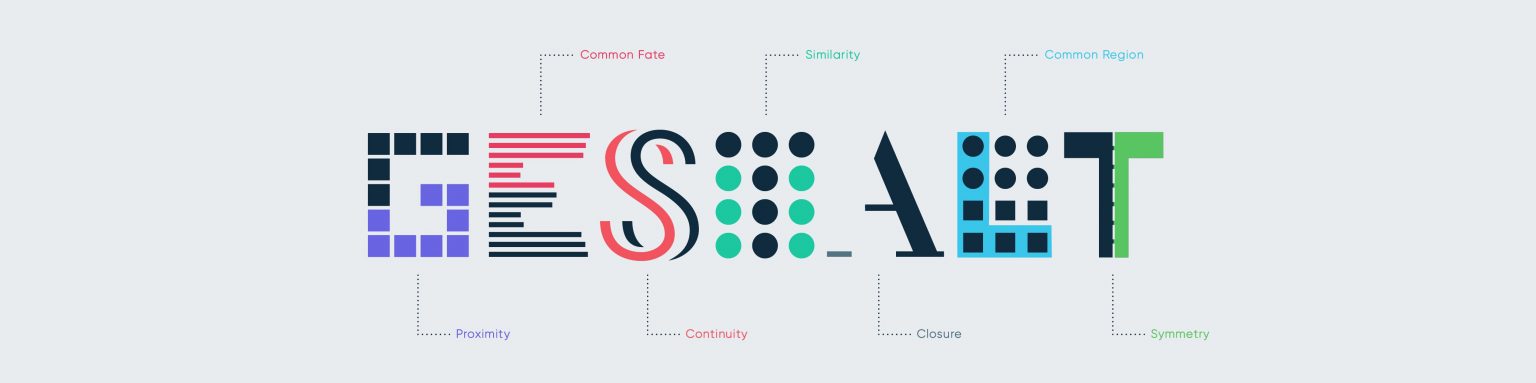
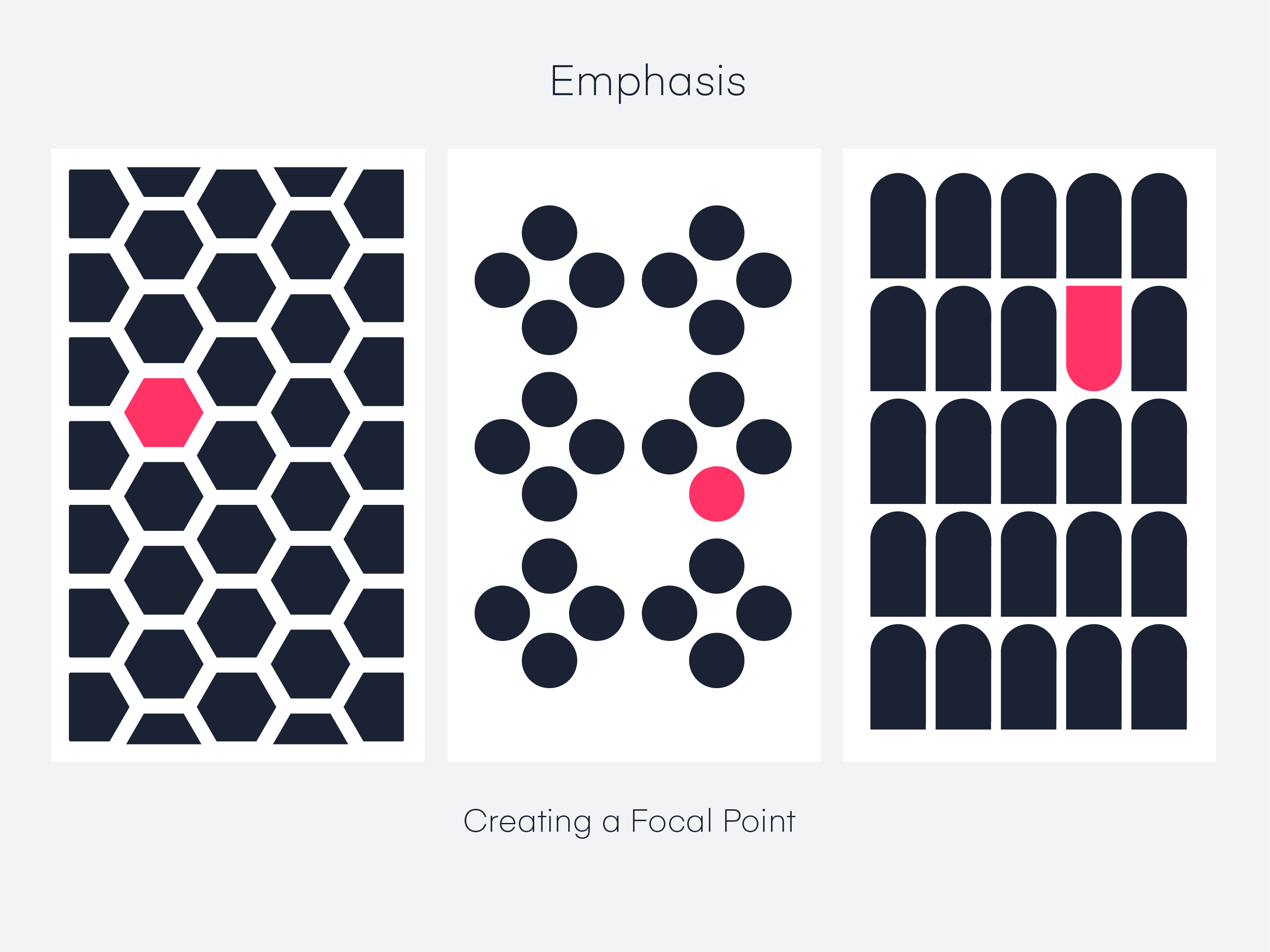
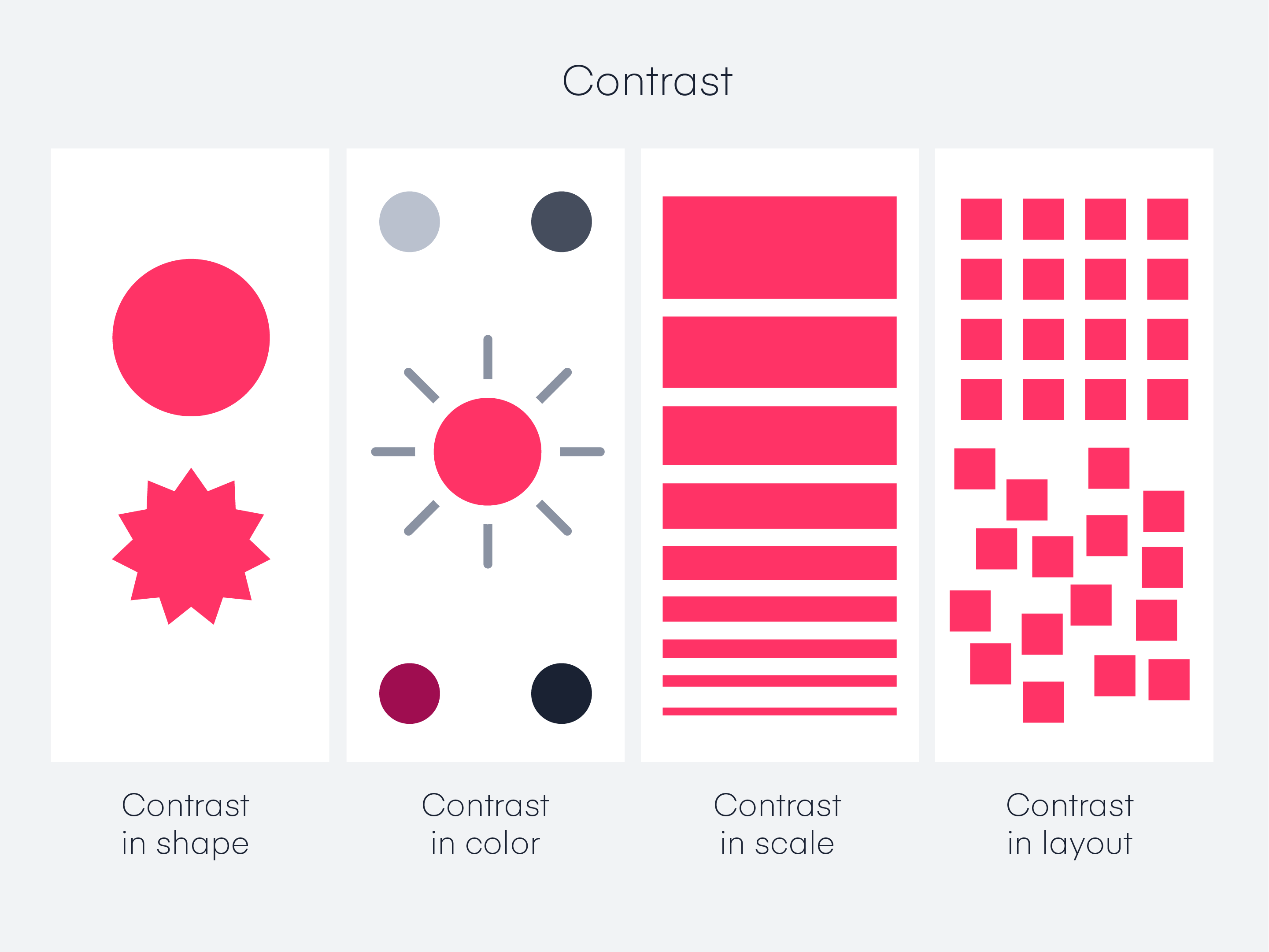
Gestalt optical illusions illustrate how our perception creates a shape that is not in fact there. When human beings look at a painting or a web page or any complex combination of elements, we see the whole before we see the individual parts that make up that whole. This idea of seeing the whole before the parts is Gestalt.

Law of Unity

Elements that have a visual connectedness are perceived as being more related than elements with no connection.

Law of Simplicity

People will perceive and interpret ambiguous or complex forms as the simplest form possible.

It is perceptive. It could be a static transition between primitive forms. It also could employ tensioned surface treatments that indicate strain and stress.

It can be friendly or aggressive, soft or tough, minimizing or maximizing.

Law of Focal Point

A point of interest, emphasis, or difference will capture and hold the viewer’s attention.

The volume or surface of the housing could be manipulated to draw or direct attention. Usually, it leads to the major interface.

Symmetrical Balance

Symmetry is a fundamental and timeless principle of visual perception. In visual communications, symmetry conveys balance, stability, and harmony.

A symmetrical balance is Static, Stationary and all the elements along the axis have equal weight.

Asymmetrical Balance

It is also called informal balance. It means the elements do not mirror one another, and this kind of balance does not rely on the principle of symmetry.

In general, asymmetrical balance tends to have a greater sense of visual tension than symmetrical balance, which creates a focal point.

Similarity

Things that are similar are perceived to be more related than things that are dissimilar.

The characteristic elements could direct viewers' attention. It could be dynamic or mathematics defined.

Through repetition of color, size, orientation, texture, font, shape, etc., designers can have some elements appear more related. Collectively, those elements carry more visual weight,

Continuity

Elements arranged on a line or curve are perceived to be more related than elements not on the line or curve.

Continuation carries substantial visual weight and helps group the elements, unify components, and lead the user's attention.

Closure

According to the principle of Gestalt, When looking at a complex form with many elements, people tend to look for a single, recognizable pattern.

People fill in the missing information to make for a single recognizable pattern.

Common Fate (Synchrony)

Elements moving in the same direction are perceived as being more related than elements that are stationary or that move in different directions.

Proximity

Things that are close to one another are perceived to be more related than things that are spaced farther apart.

This rule is helpful for interface design. The relative nearness items are usually perceived as a group. Size and shape would still communicate information, such as a hierarchy of the interface.

Common Region

Elements tend to be related together if they are located within the same closed region. It is useful, especially for the user interface.

Adding borders (common region) around a group of buttons is an easy way to create separation from surrounding elements.

More Relations

Contrast

Contrast fundamentally provides viewers with a noticeable difference in size, color, texture, material, solid and void, etc.

Contrast is the opposite of visual harmony. It focuses more on visual impact, and It's about the balance of harmony and emphasis.

Contrast is a perceptible difference in visual characteristics that makes an element distinguishable and distinct from other elements. It can direct attention and create hierarchy, emphasis, and emotion in a complex setting

Pattern

A pattern is a specific type of visual texture and it has a strong relationship to geometry. It is organized in a way that singular elements are composed on a defined and repeated structure.

It is due to this underlying structure that patterns are always synthetic, manmade, ad mechanical, and never organic.

-Repetition

Repetition helps create consistency and design flow.

-Frequency/Rhythm

When the distance between repeated objects is identical, it has a frequency. When the distance is varied between several frequencies, which is called rhythm.

-Organic Textures

-Macro Details

Many products have a simple silhouette combined with beautifully subtle details. It adds a level of sophistication and also brings a touch of personalization and uniqueness to the product.

Those surface details trace their roots back to nature, such as a representation of moving air, flowing water, or acoustic waves. IT adds a warm and dynamic visual element that speaks to the quality of craftsmanship and attention to detail. It should be done in a way that reinforces a product’s character.

HOW OBJECTS AND EMOTIONS ARE INTERLINKED?